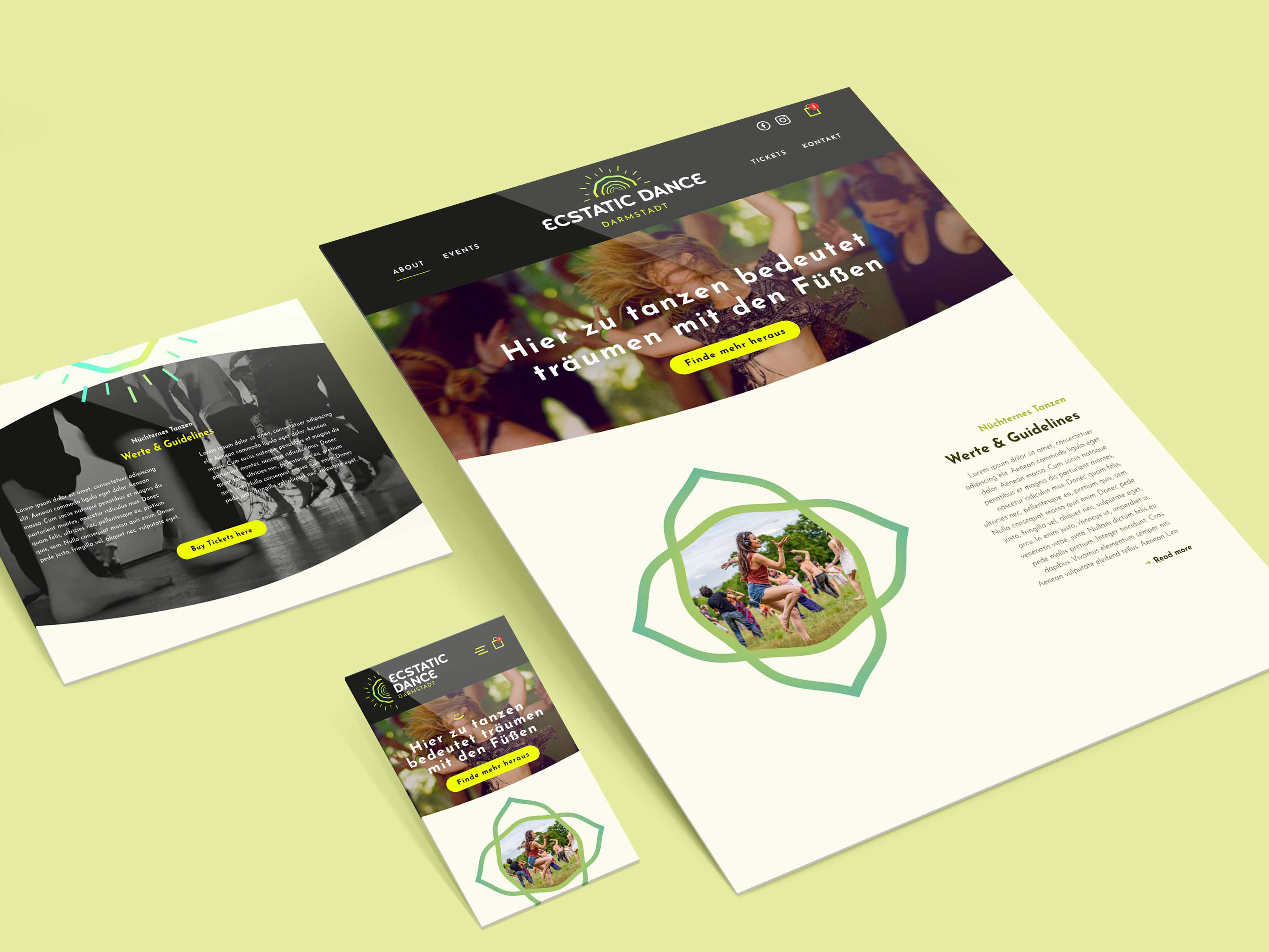
Hub Landing Page
When the client is landing on the main page he or she can choose between 2 categories, which are two separate full one pagers. Gestalttherapie and Supervision. The entire colorscheme is differentiated blue and green to give the user the best possible orientation. To emphasize the two different categories, i gave them 2 distinctive icons. The turtle for Gestalttherapie and the eagle for Supervision. Both have video backgrounds in the hero sections. On the landing page i was merging both of the videos together. The goal with this page was to inform the user about basic contact information and the two options to choose from.
So you can either go to the Gestalttherapie Page (GREEN) or the Supervision Page (BLUE).
Both have a very distinct graphical language to make it easier to the user to navigate. Also, to underline the two different messages which each of this fields has.
The wavy, round shapes for GREEN are highlighting the softness, empathy and kindness from the therapist when he is doing his therapeutic work.
I built a whole story around this fact. The turtle is moving down when you are scrolling and portraying the journey to the ground of your soul which the therapist is giving guidance and advice. During it's travels it's meeting other sea creatures which are demonstrating other aspects of your soul. I was using parts of the logo for shapes, picture frames etc. to give it full context and connection.

For BLUE the Supervision Page, i went with straight diagonal lines to show direction and leadership. The edges of the buttons, the section divisions, the interactive boxes, all have 90° edges to keep the shape language consistent. To give connection to the logo respectively the "brand" i decided to give certain elements the shape of some logo elements. The color language is consistent in blue. For the reason Martin Rohm is not as long as in Gestalttherapie, it wouldn't have made sense to tell a story. it was more of a introduction in his supervison role.
Both one pagers have the goal to give the client full information about his work and him self. Then he wants to collect email adresses to grow his client base.
It was really fun to create the footer since it's quite complex and many links. To give the user full orientation i decided to go with different color gradients depending on the field.

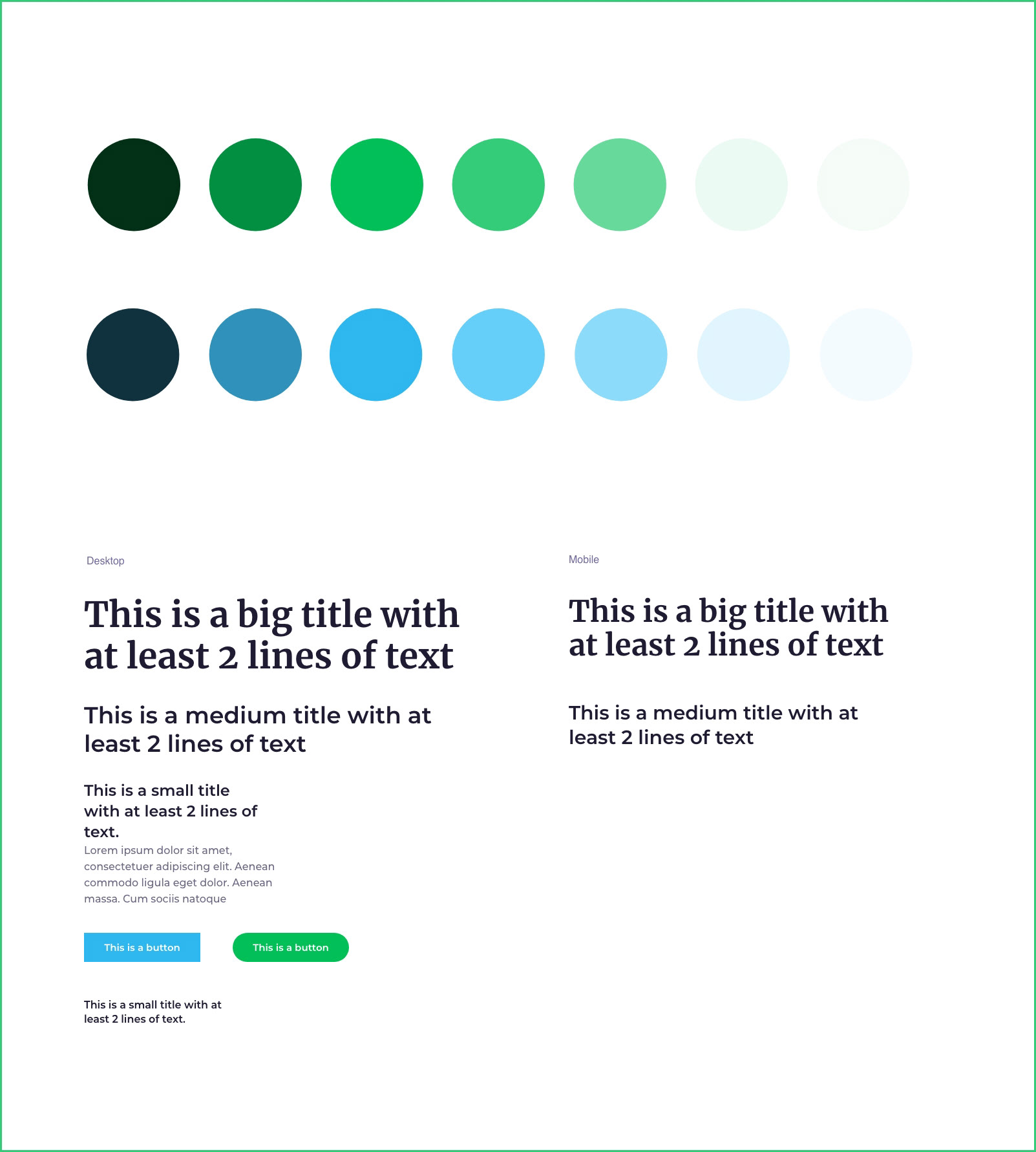
Styleguide
I like to create a styleguide in the beginning phase when i plan a website because this ensures consistency throughout the design. Why is that important? It gives the user a great user experience where he/she can navigate easily through the entire website because it is easy to understand where to find what. In this case i went with 2 different main colors which underlines Gestalttherapie and Supvervision. The light colors are great for a subtle background because pure white would be too strong for the eye and also it would look boring.
Styleguide
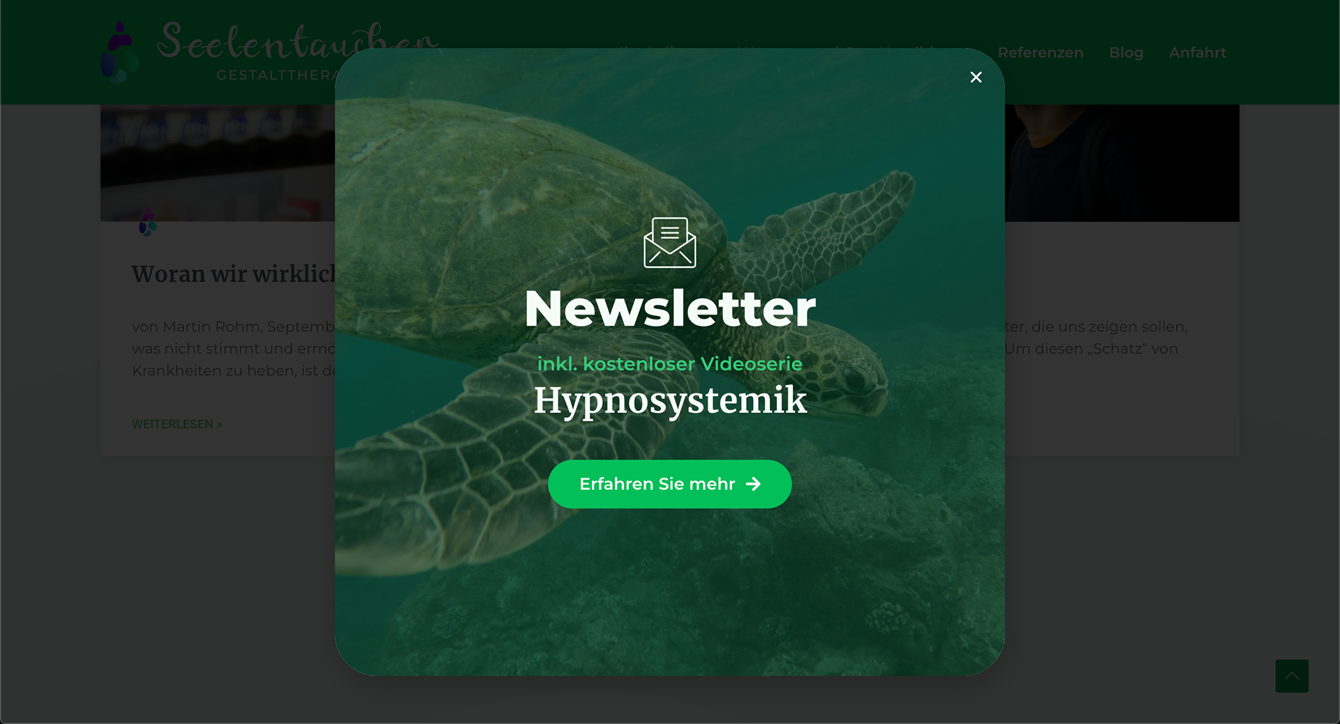
Newsletter popup
Popups are a great way to give your website more fun when done right. You click on a button or scroll down the landing page to around 85% and this little graphic pops up. It can be contact information like on the left or an email newsletter popup with a function.
Newsletter popup
You want to work with me? Tell me more about your project!